A desktop comparison misses a different state
The desktop navigation still contains Home, Pricing and Help. Its before and after screenshots match exactly. At a narrow viewport, the same site uses a Menu button. Opening that menu reveals the regression: the Pricing link has disappeared.
This fictional Fieldnotes example isolates a responsive branch. The desktop markup stays unchanged. Only the contents of the mobile disclosure change. Both closed mobile screenshots also match, because the affected links are hidden until the button is activated.
Compare the captured states
Scroll horizontally to see all columns.
| State | Before | After | What the comparison establishes |
|---|---|---|---|
| 1440 px desktop | Pricing visible | Pricing visible | The desktop navigation retains the link |
| 390 px, menu closed | Links hidden | Links hidden | This state does not reveal the missing link |
| 390 px, menu opened | One Pricing link | No Pricing link | The tested mobile navigation lost the link |
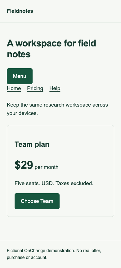
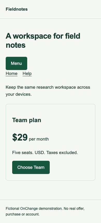
The test activates the visible Menu button and records aria-expanded="true". It then counts Pricing links inside the named Mobile navigation region. The result is one before and zero after. It does not infer this result from a screenshot alone.
Add state to the monitoring brief
“Check the homepage on mobile” leaves a question unanswered: which state of the homepage? For this case the useful record is “390 × 844 CSS pixels, Menu opened, Pricing link present inside Mobile navigation.” Include the action required to reach the state and the evidence you expect to preserve.
A responsive site may also have dialogs, tabs, accordions, validation messages, cookie choices and signed-in variants. Select states according to the user journey and the risk you need to review. A screenshot of the initial page cannot establish the behavior of every hidden control.
The W3C disclosure navigation example provides a reference for a disclosure button's expanded state and controlled content. The fictional menu here borrows that basic relationship; it is not a full implementation or evaluation of every interaction in the reference example.
Keep desktop, viewport and device claims separate
The two viewport sizes use the same desktop Chrome engine with scale factor 1. A 390-pixel viewport is a responsive-layout test. It is not an iPhone, Android device, mobile Safari session or touch test. Device input, browser behavior and assistive technology still require their own evaluation when they matter to the release.
The experiment proves a missing link in one captured menu state. It does not establish that the destination page is unavailable, that all mobile navigation paths fail, or that every narrow width behaves identically. The example links target local page fragments; no production checkout or business conversion is exercised.
Reproduce the missing-link check
Open the baseline fixture and changed fixture at a width below 600 CSS pixels, then activate Menu. At 1440 pixels the desktop navigation is visible instead.
The results JSON records initial screenshots for both widths and open-menu screenshots for the narrow viewport, including hashes and the observed link count. The reproduction kit repeats the actual button click and assertions against a local server.
Decide what needs another look
Confirm whether removing Pricing was intentional. If it was accidental, restore the mobile path and retest the open state. If it was deliberate, inspect how people are expected to find plan information through the revised journey. Preserve the before/after evidence with that decision.
Use the monitoring brief template to name the state, viewport and review owner. For changes to navigation meaning and keyboard journeys, continue with the accessibility navigation retest example.